Monday, 26 January 2015

(GROUP POST) Evaluation Q1 - In what ways does your media product use, develop or challenge forms and conventions of real media productions?

All music videos follow certain conventions but the style of a music video will greatly depend on the genre, which then effects what conventions are used although there are some general conventions. General conventions include artist singing into camera, and a range of close up, medium and long shots. The promotional package which includes the digipak and advert can also follow institutional conventions by using features of real media products. 

After a lot of similar product research and looking at the conventions of a typical music video, Ellie and I decided that we would use the majority of these conventions to create an effective music video. Our music video has been inspired by artists such as Ed Sheeran and Tom Odell whose songs are of a similar genre and pace. One of the conventions that we used was the artist singing into camera. This convention is commonly used across many genres of music videos and helps to engage the audience with the artist giving the audience a more personal feel from what they are watching. We felt this was important convention to use because the song and video revolves around different relationships and all kinds of love. 


 Another convention we used was having both a performance and narrative based music video. Music videos with the same genre as ours usually had a mix of both concepts and we believed that we could emphasise feelings and emotions stronger through narrative visuals alongside the performance shots and lyrics. We applied Goodwin’s theory of ‘the relationship between lyrics and visuals’ because we felt that the visuals help to highlight the meaning of lyrics for the audience. 


We also used conventions of shot and transition length and shot types. From our research, we found that for our chosen genre, the length of shot was approximately 5 or 6 seconds and each shot transition was either a regular cut or slow cross dissolve. We decided to use both of these conventions so that our audience could recognise the genre from the pace. Another convention we used was cutting on the beat. This is very common in our style of music video so we felt it was important to use it in order to create a realistic product.


One way that we challenged conventions was by having black and white film for the performance shots. This was inspired from Adele’s music video for ‘Someone Like You’ because we felt that the black and white complimented the feeling of the song and helped to express emotion. Although Adele’s music video was an inspiration, her video is all in black and white, whereas we developed the convention because we only used it for the performance shots so it magnified the meaning of the lyrics.                                                                                                                                                                                                                                                                                                                                                                                                                        
                                                                                                                                                                                                                                                                                                                                                                                                                                                      For our digipak, we kept to the institutional conventions using realistic features such as bar codes, record labels and copyright to create a product that looked professional and genuine. The adverts we created also followed themes of black and white from our music video and digipak. This is maintaining conventions of real media products because you are creating synergy for the audience so that if they see the advert, they will be able to recognise the CD on the shelf because of the similar design. 


We stuck to the majority of conventions for our digipak and adverts but we challenged a convention for the front cover on our digipak. We have challenged the conventions by not having a photograph of all the band members which is commonly used on digipaks. We decided not to use a group shot for our front cover and instead used a still from our music video. The still is a shot of Becky and Will looking at the lake with there backs to the camera. We decided to use this still because it helped to reflect the overall feel of our music video to our target audience. Not only does this still challenge conventions because its a two-shot, Becky and Will aren't looking into camera which is frequent convention on the front cover of a digipak. 

Overall, I think that we achieved our target of creating a music video that could easily be recognised by the genre and look realistic. We did follow certain conventions which made the filming and editing a little easier because it created a basis for our music video to allow us to work further on. But, having challenged some conventions, we have created a media product that is slightly different and can stand out from other products of the same genre. 


Wednesday, 21 January 2015

(GROUP POST) Evaluation Q3 - What have you learnt from your target audience feedback?

Throughout our project, Ellie and I presented our target audience with many forms of surveys in order to get all the information we would possibly need to meet our target audiences expectations. During research & planning we conducted a paper survey which helped us understand the main basis of what our target audience wanted from a music video. These were our results:

Initial Target Audience Research
Ellie and I distributed 20 surveys to people aged 12 - 30 to get a wide range of feedback on what young and older people want from a music video.  Although we are mainly aiming our video at older teens/young adults, we were interested to see why people of other ages watch music videos and what they like to see. The feedback from our survey is on an 'infogram' presentation. 


The results were: 


  • All of our TA wanted to see 50% performance shots with the stars looking into camera and 50% narrative shots. We believe that we did manage to differentiate the shots well and incorporate both in our music video.
  • 50% of our initial audience wanted to see our video filmed at an outside location and the other 50% wanted to see an inside location, such as a studio. We think that we used an appropriate amount of both inside and outside locations, which suited our genre accordantly.
  • We asked our audience if they like to get a feeling from the video, 13 people said no, therefore Ellie and I didn't feel pressured to create a certain mood or atmosphere. 
  • Our TA results showed that they are mostly attracted to a music video because of the artist and the song so when we created our promotional package we took this into consideration.
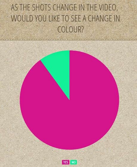
  • The majority of our audience said that they would like to see a change in colour of shots. We think that we did this successfully because we decided to use black and white for performance shots and sepia/colour shots for our narrative.


From our initial research we successfully found out what our audience wanted from our music video so this enabled us to decide what conventions to develop and challenge. If we were to do this task again, we would definitely conduct a paper survey again because it was very effective and we received a wide range of feedback.

According to McDougall's (2009) audience theory, he suggests that the online age is getting harder to identify and argues that an audience is 'just a hypothetical group of people, imagined for the sole purpose of having a target for a media product'. This theory proposes that our audience feedback isn't very significant and will not necessarily advise us on how to improve our music video.

We conducted a focus group in the early stages of editing whereby a group of people aged 16 and 17 watched our first rough cut of our music video and gave feedback. We received mixed responses and this is what a few people said:

Male, 16 - "I like the different shots and colours but not sure what the concept is."

Female, 17 - "I like the way the shots have been put together with transitions but I'm not keen on the inserts because they look too sharp. Also, I like how the video is similar to a story too."

Female, 16 -"I really like the concept of the music video and I like the scenery shots of the trees and lake, so it would be nice to see more of this."

Male 16 - "The piano shots look good because it shows the instruments and I like the nature feel to the video of the lake and trees." 

Male 17 - "Overall I liked the music video because of the combination of performance and narrative shots but I don't like the curtain background because it makes it look less professional."

Our results showed that the majority of female viewers understood the 'love' and 'relationships' concept of our video although some of the males didn't. From this, we decided to add more narrative shots of the children with their parents and Becky with Will, this was so there was more of a story line to follow and it was more understandable. Something that was mentioned by more than one person was the backdrop on the performance shots. This was something that Ellie and I found very difficult to hide and no matter how many filters or colour masks we put onto it, it just didn't look any better. However, boosting the contrast and brightness did help along with the black and white effect. We added a few inserts onto some of our shots which acted as flashbacks but one person said they looked too sharp and someone else said they didn't understand why they were there. To resolve these issues we removed most of the inserts but kept one or two and changed the outline so it was softer. Also, we used Goodwin's theory by showing a relationship between lyrics and visuals so that it was easier for the audience to understand. 
Some of our target audience really liked the shots of the lake and the trees and didn't feel there was enough of these type of shots, so we decided to incorporate more into our video. We didn't want to remove any of the other existing performance or narrative shots so we changed the opacity to layer two shots together. Overall, we received positive reviews with a little criticism which we took into consideration and helped us to make changes to meet our target audience demands. 


This is an example of how we added more scenery by changing the opacity of 2 different shots.


This is an example of how we changed the colour of shots and upped the brightness and contrast to discuise the curtain background.


We also conducted another focus group interview when our music video was finished. The group responses varied.

1)All people understood the concept. 
2) 


Ellie and I also posted our Music Video on YouTube to get feedback however no one commented a response to our video therefore, on reflection we could see that this didn't help us in any way. Also, from this we have learnt that if we were to conduct this research again, we wouldn't rely on YouTube for feedback and possibly use a social network such as Facebook or Twitter. 

Tuesday, 20 January 2015

(GROUP POST) Evaluation Q4 - How did you use media technologies in the construction and research, planning and evaluation stages?

Before we started planning and filming our music video, we created a blog on 'Blogger' to enable us to continuously update our journey through the making of our music video. We used the blog in our AS course and also in our A2 course. We used the blog to write posts about everything from our choice of music genre, our research and our preferred filming locations. This is a technology which we had previously used in our AS media project so we were well aware on how to use it but this year we became more aware on how to organise our posts so it showed a continuous journey and learnt new skills such as how to embed a video.


Last year we used 'Prezi' for certain posts in our course, such as, target audience research analysis, this year however, we didn't use it. We have found 'Prezi' quite difficult to use and prefer to use other technologies such as 'Infogram'. We also created a few power points on Microsoft and uploaded them onto 'Slideshare'.

Youtube was used to conduct our similar product research. We found Youtube very easy to use and very useful as the videos are highly accessible which made the research process quicker for us, meaning we had more time to plan our own music video. Unlike the similar product research in AS, we were able to simply type in the music video we were looking for and it would be there in a matter of seconds, whereas in AS, we had to look on numerous websites to find existing magazine examples. 


The photography and filming part of the task was produced with two LUMIX FZ60 cameras using additional accessories such as tripods. We were already familiar with the cameras and there settings from our AS project so this made the filming part easier but we did have difficulty with the transition from still images to movement but we soon got used to the idea after a few trial takes.


When we produced our risk assessments, call sheets and child permission forms, we used Microsoft Word. We are both very familiar with this programme as we have used it many times before in AS, A2 subjects and wider uses, which made things easier to produce.


This year we used Final Cut Pro X to create our Music Video. At the beginning of this years course, we create a short documentary about sixth form to help us get used to the program. From the first documentary we constructed, we learnt how to upload footage from our cameras and import shots onto the timeline and cut them. We became competent in using transitions and filters on specific shots, which helped us to create a professional looking music video.


Overall we used several technologies to help use create and publish aspects in this year's course. I think without using certain technologies the task would haven proven difficult.

(GROUP POST) - Final Music Video


This is our final version of our music video.

Monday, 19 January 2015

(GROUP POST) - Final Adverts


This is our final adverts, one to promote the album and one to promote a tour. We decided to use the outdoor theme with the trees as well as stills from our music video because it creates synergy between all of our promotional package and music video.

(GROUP POST) Final Digipak


This is our final digipak. We have continued to use black and white and sepia colours like in our music video to create synergy along with the theme of the lake and trees which will make it more recognisable for our target audience.

Sunday, 18 January 2015

(GROUP POST) - Our merchandise

This is some merchandise we have designed which could be part of our bands promotional package. From research with existing artists we found that merchandise is popular. Fans are drawn to designs that are easily recognisable with the artists they like so it is important to keep a common theme. Here we have created synergy through through the designs because of the feather and tree theme linking back to our music video and digipak. If the merchandise is a success, there is a potential for high sales and the artists becoming more well known.


Saturday, 17 January 2015

(GROUP POST) Advert - Draft One


This is a design that Ellie has created for our advert. I like the picture because it is a group shot which will be good for advertising because people will recognise the band. I like the overall advert but think it would look better if there was more information and possible a vignette background.

Friday, 16 January 2015

(GROUP POST) CD design

This is my design for our CD. I have chosen to use a photo of trees because it links in with our video well and overall outdoor theme. The colour also links to our music video because we have included sepia and black and white colours throughout our task. 

(GROUP POST) Digipak - Third Draft


This is a design that I have created. I like the autumn theme on the front and back covers and the black and white photo because It links to the shots in our music video. I also like the font on the front cover. We could take some elements from this design along with other elements from our other designs to incorporate them together for our final digipak.

Thursday, 15 January 2015

(GROUP POST) Digipak - Second Draft


This is Ellie's design, I like the the back cover of the two people sat at the lake because it links in with our debut single. I like the design on the front cover of the feather but I think if it was on the digipak it wouldn't look at professional because it's hand drawn. We have talked about the design and have said if we decide to use it we will generate a better design on Adobe Elements 11. 

Wednesday, 14 January 2015

(GROUP POST) Digipak - First Draft


This is the first draft for our digipak. We designed it together and have decided to incorporate photos of scenery to link with some locations in our music video. We like the colour scheme but think we need to add a photo of the bad somewhere on the digipak. This is something to consider when we construct another draft.